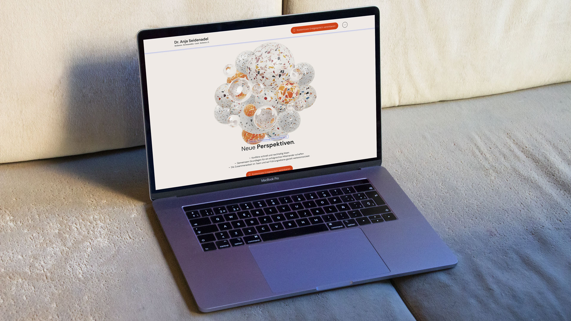
A website that begins by dissolving tension. Visitors encounter a cluster of marbles, representing conflict and weight. With a simple scroll, the knot unravels, the marbles drift apart, and the first problem is already resolved. This interaction sets the tone for the entire digital identity: calm, resolute, and always guiding towards clarity and action.


People land here in a moment of friction. Queues of thoughts, competing voices, legal nuances. We wanted the very first touchpoint to restore agency: a cluster of marbles drifts apart as you scroll. No instructions, no friction—just a gentle cause-and-effect that says: you can move this. That tiny win creates trust, curiosity, and momentum.
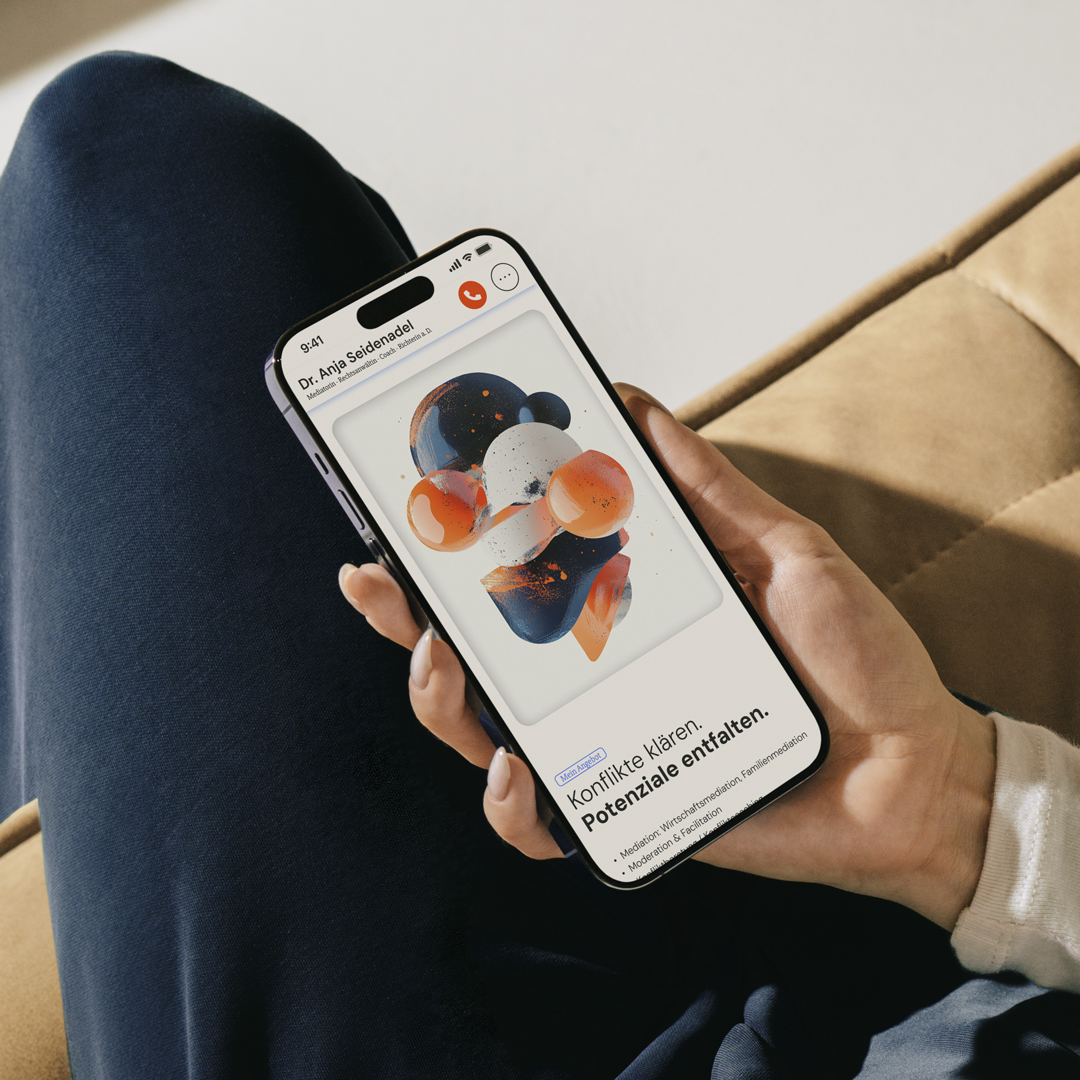
This is more than a website. It’s a calm, confident identity for mediation, coaching, facilitation, and legal advice. Abstract illustrations carry two energies at once—quiet and resolve. The interface stays understated, the typography unhurried, the actions unmistakable. Every page ends with the same promise: clarity is reachable.
Notice → Interact → Relief.
A small physics moment on page load—a cluster representing the issue at hand. As you scroll, elements separate and settle. The motion is subtle, respectful, and opt-out for sensitive users. The effect is simple: relief is felt, not claimed.
Design with purpose.
Every interaction in this digital identity has a goal: to reduce friction, build trust, and turn attention into action. Even without hard numbers, the signals are clear.
From the very first scroll, visitors are invited to take part. The interaction sparks curiosity and keeps them moving forward.
Every page resolves doubt. FAQs untangle questions, while consistent design choices make the path unmistakable.
Each journey ends in dialogue. A clear call ensures interest transforms into direct contact — no dead ends.
Strategy × Design × Technology — aligned for real impact.
We shaped the digital identity end-to-end: concept, interaction model, illustration system, UX writing, and build. Our north star: experiences that feel human, reduce cognitive load, and make the next step obvious.
Design & Creative Direction: Supermarkt.works
Illustrations: midjourney
Technology: Spline (3D) + webflow